Care’s Creamery
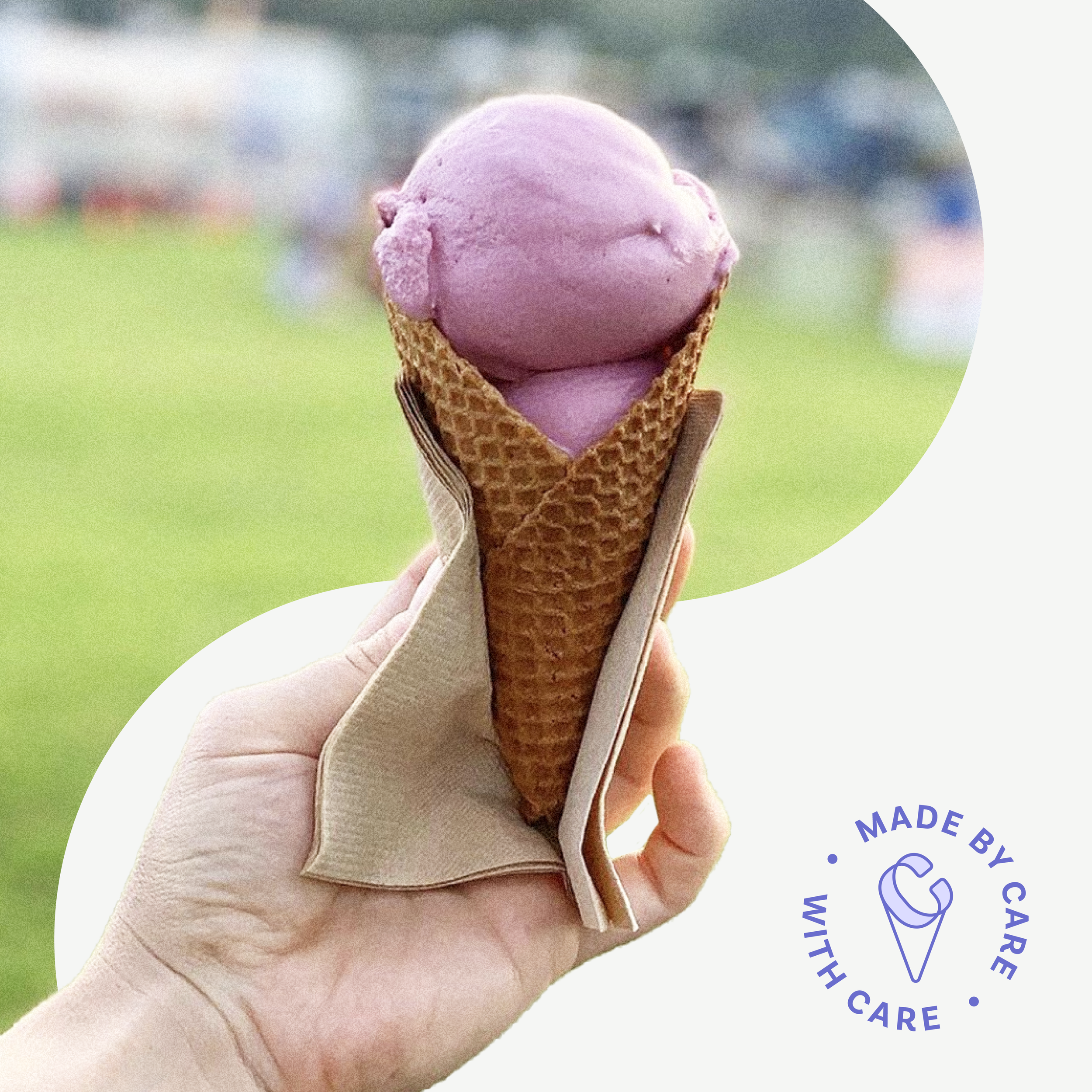
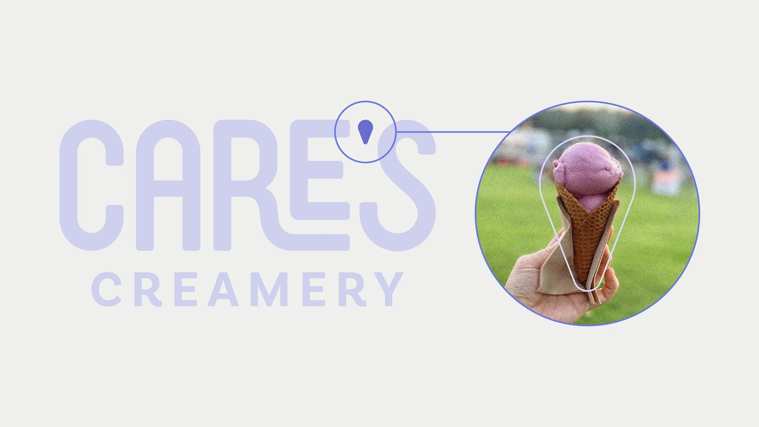
Cares Creamery was created to bring people together through nostalgic, small-batch ice cream inspired by local ingredients and community connection. I developed the brand from the ground up, creating a playful visual identity that balanced handcrafted charm with a polished retail presence.
Scope —
Logo Design
Brand Expression
Packaging Design
Role —
Creative Direction
Visual & Brand Design
Packaging
Print Production

Brand identity —
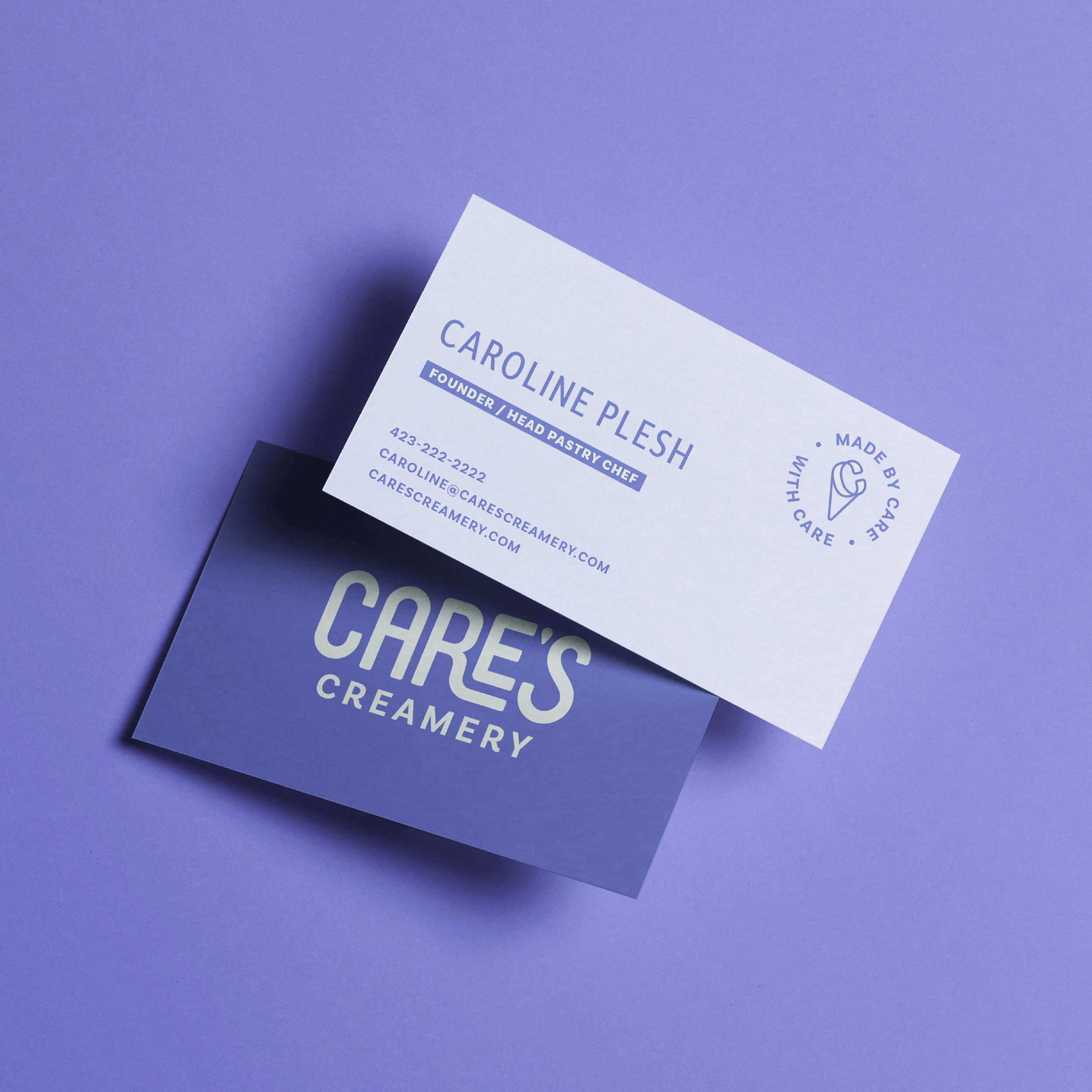
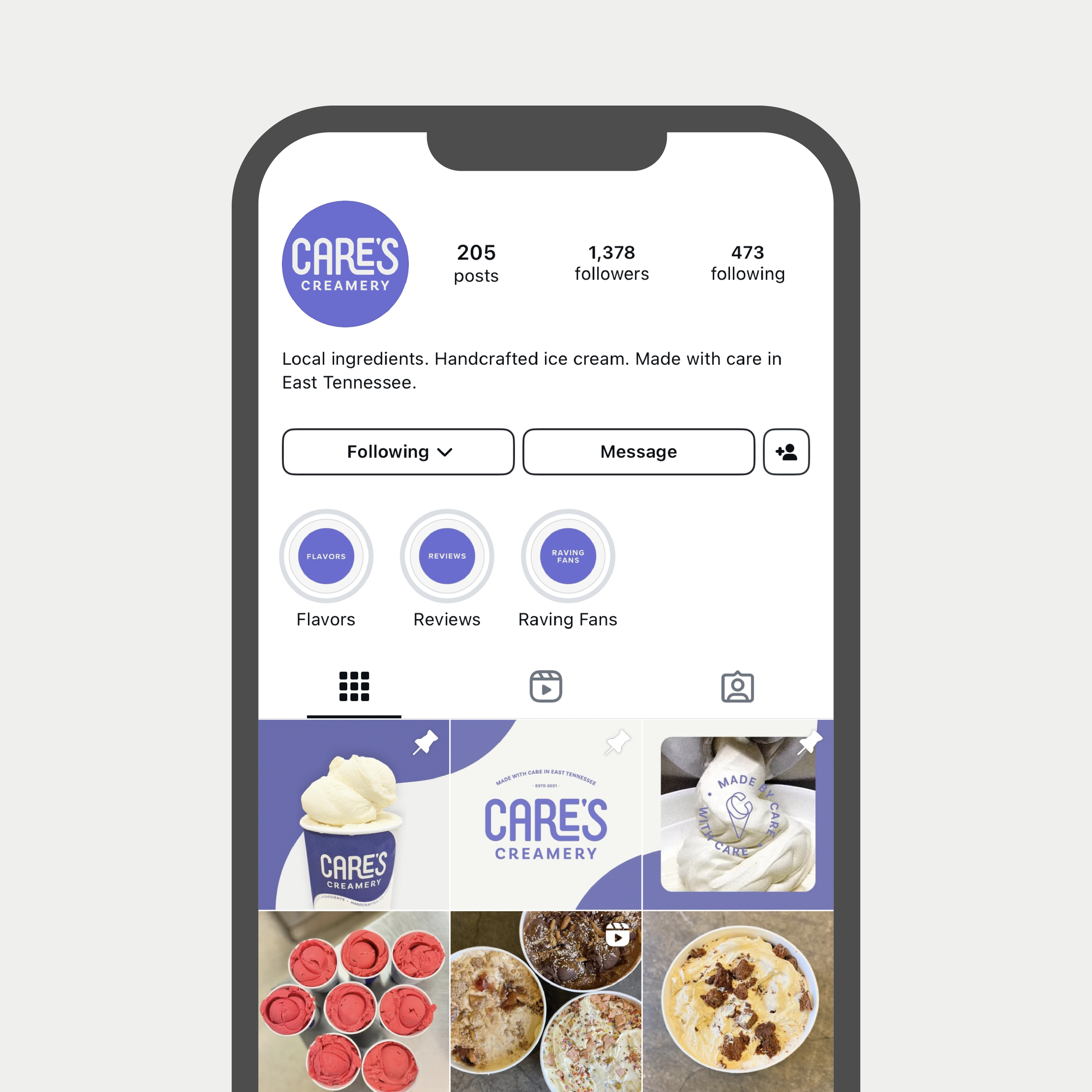
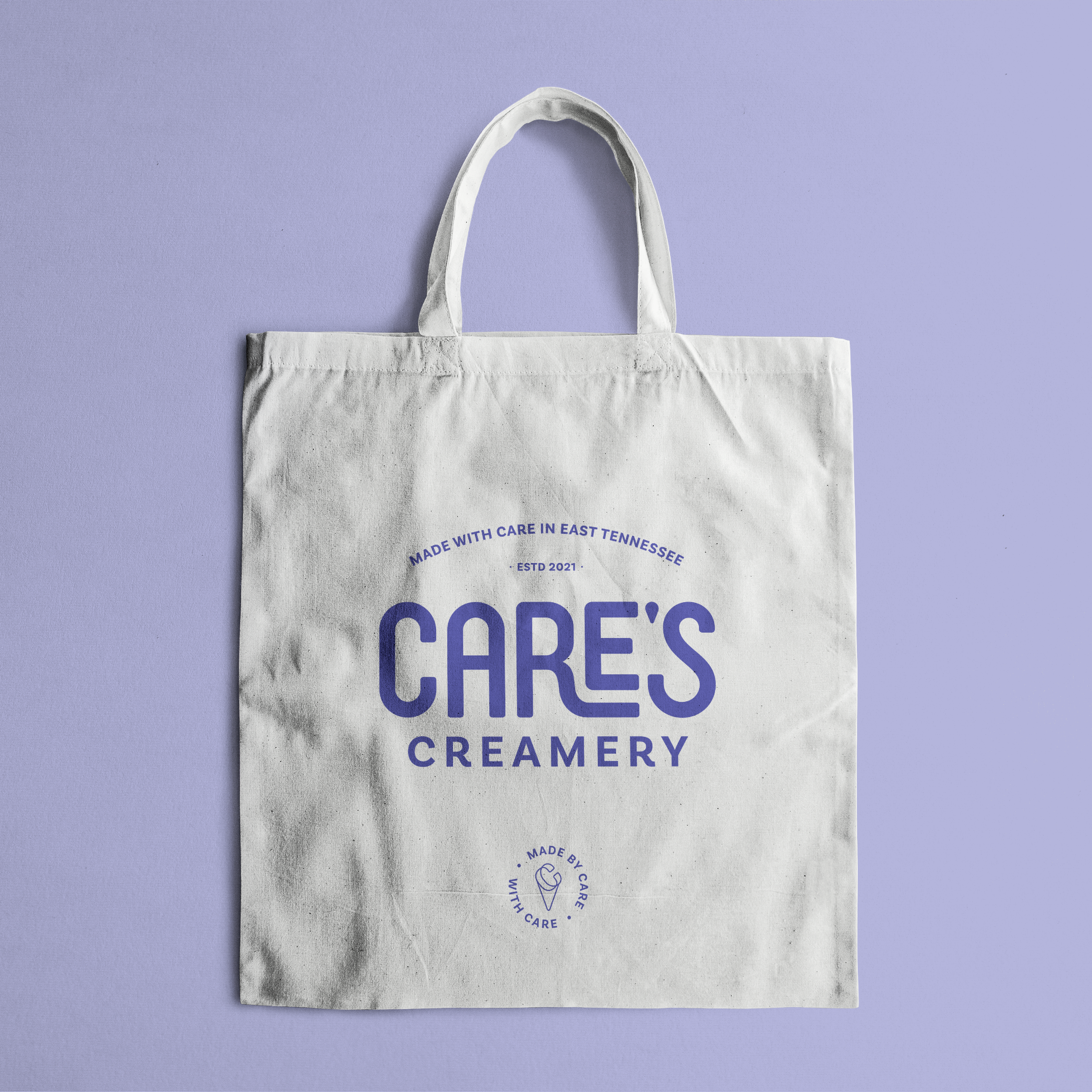
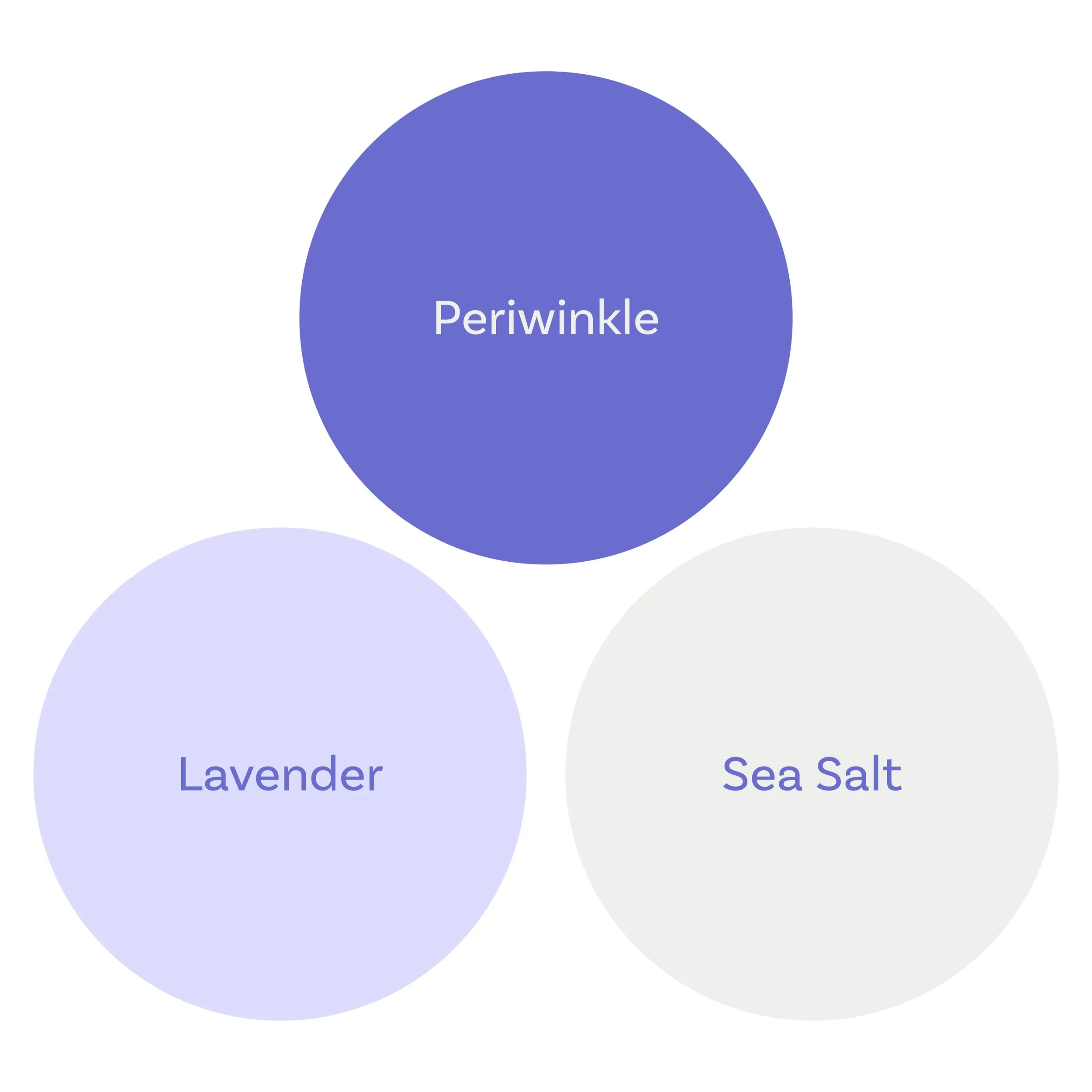
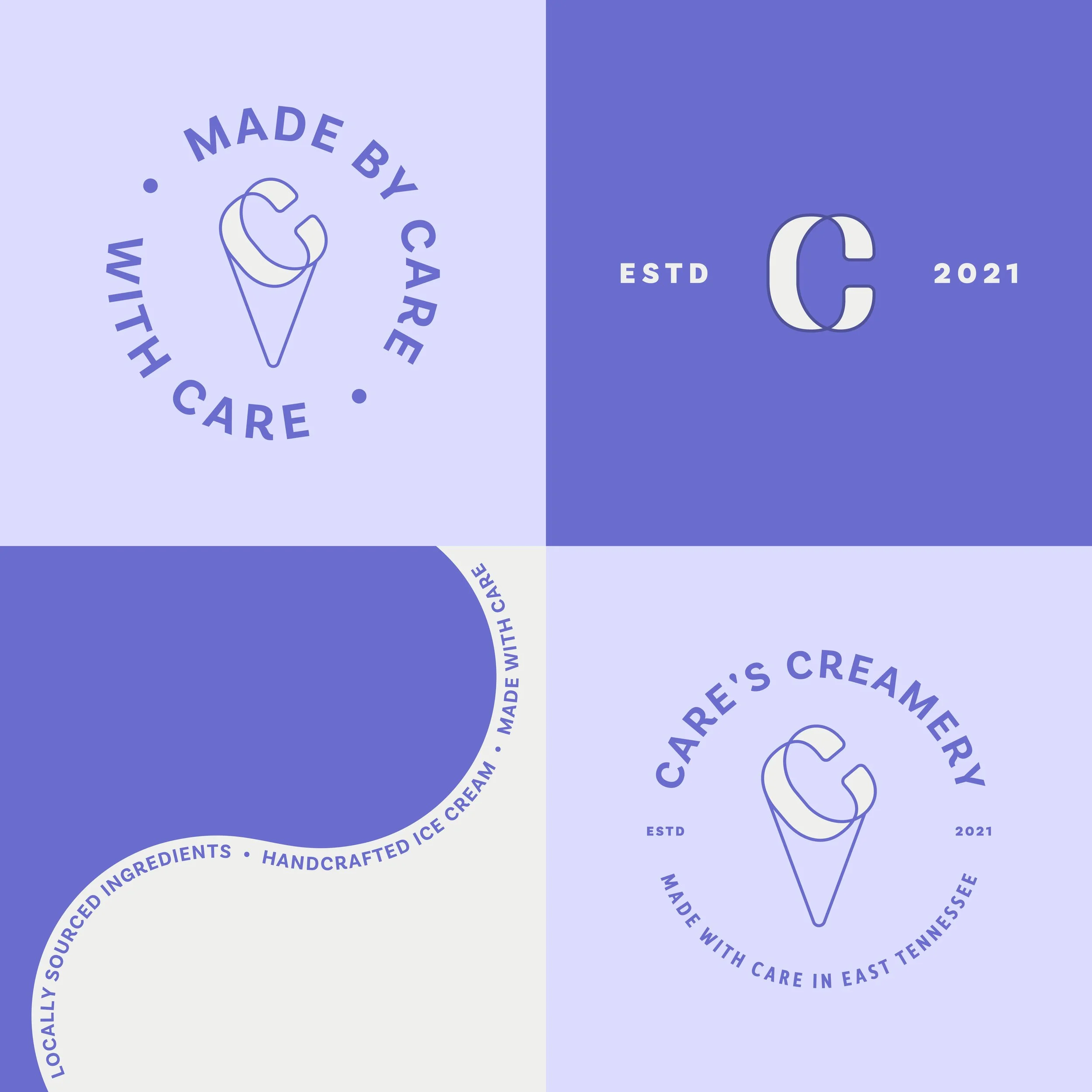
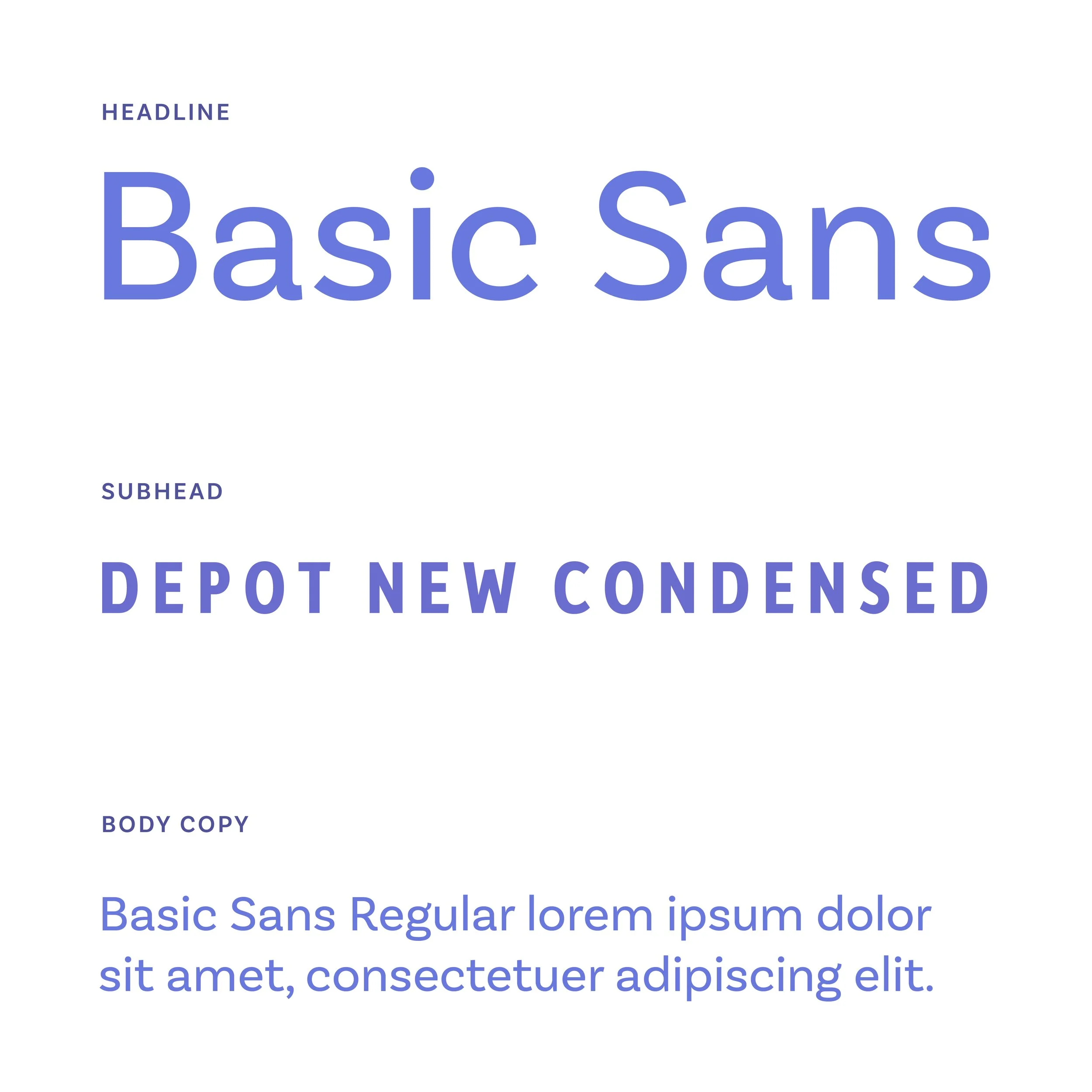
The visual identity combines expressive typography, vibrant color, and custom illustration to create a brand with warmth and personality. Every element was designed to build recognition while giving Cares Creamery a voice that feels authentic, inviting, and distinctly local.

Packaging —
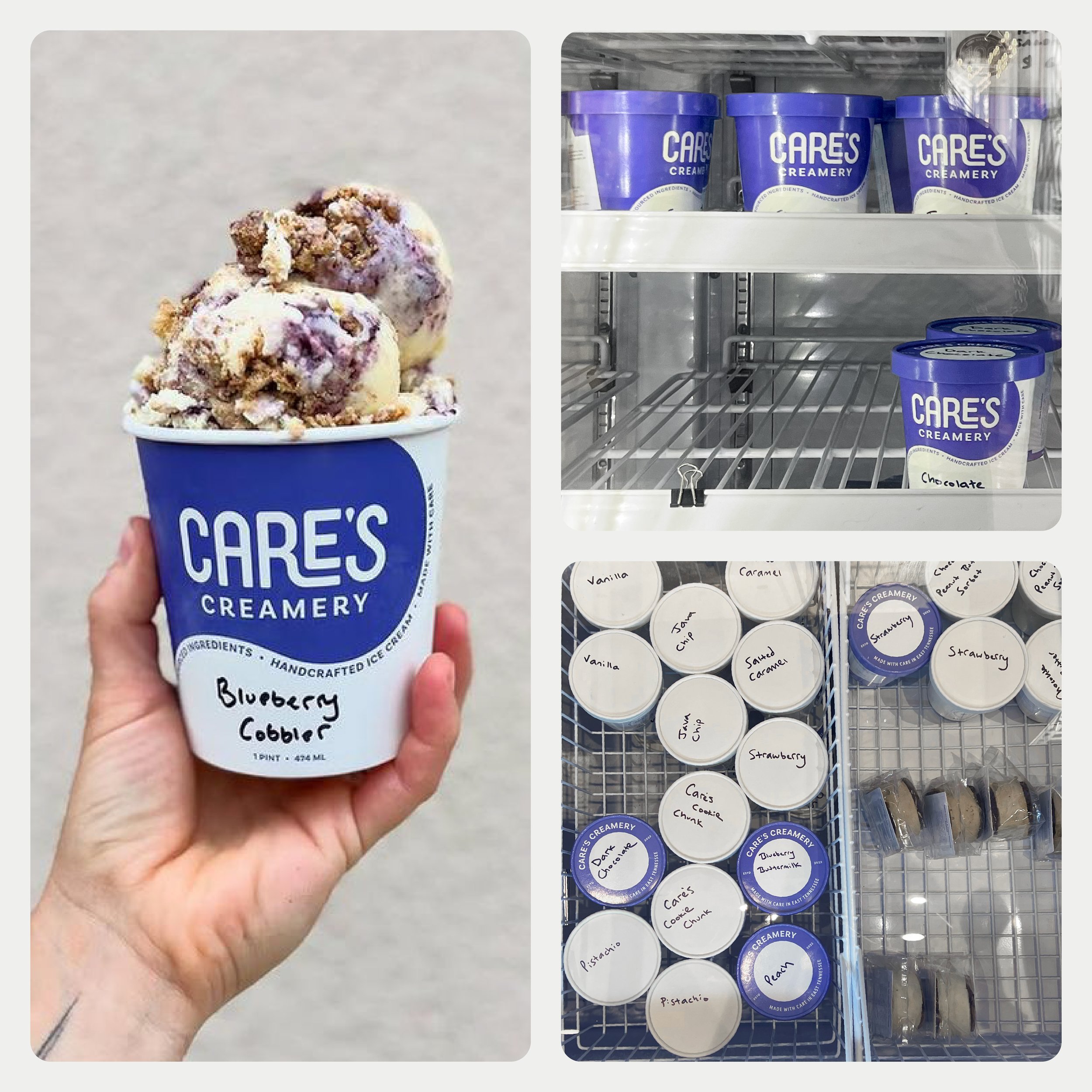
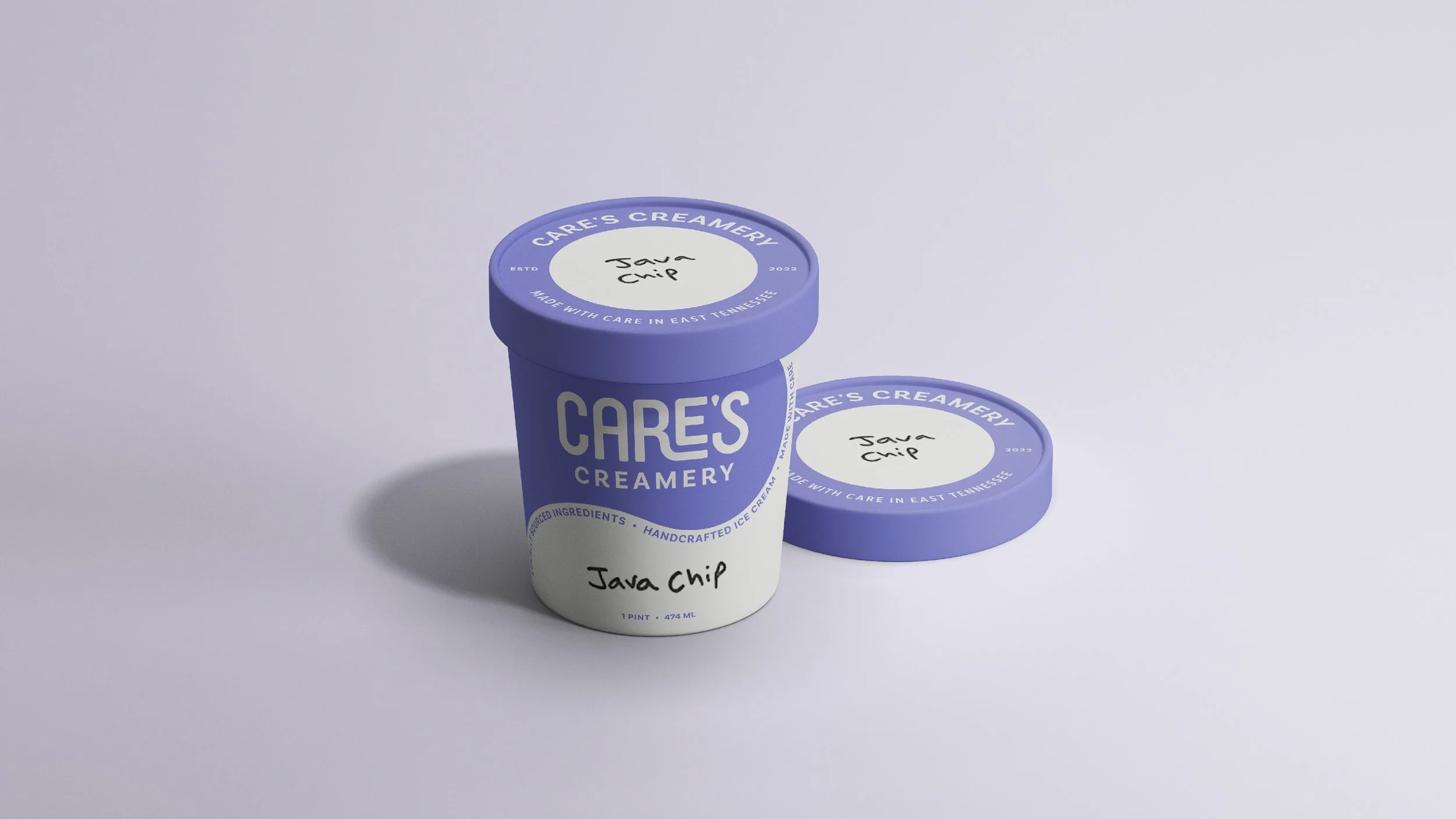
The packaging system was designed to perform in multiple retail environments, maintaining a strong visual presence both on the shelf and from a top-down view in a chest freezer. A dedicated space for handwritten flavor names gives the owner the flexibility to introduce rotating small-batch flavors without redesigning the packaging, creating a system that supports day-to-day operations while maintaining a cohesive and recognizable brand.